class: center, middle, inverse, title-slide # Unsupervised Learning ### Thierry Warin, PhD ### quantum simulations<a style="color:#6f97d0">*</a> --- background-image: url(./images/qslogo.PNG) background-size: 100px background-position: 90% 8% # Navigation tips - Tile view: Just press O (the letter O for Overview) at any point in your slideshow and the tile view appears. Click on a slide to jump to the slide, or press O to exit tile view. - Draw: Click on the pen icon (top right of the slides) to start drawing. - Search: click on the loop icon (bottom left of the slides) to start searching. You can also click on h at any moments to have more navigations tips. --- class: inverse, center, middle # Outline --- background-image: url(./images/qslogo.PNG) background-size: 100px background-position: 90% 8% ### outline 1. Principal Component Analysis (PCA) 2. k-nearest neighbors (KNN) --- class: inverse, center, middle # Principal Component Analysis (PCA) --- background-image: url(./images/qslogo.PNG) background-size: 100px background-position: 90% 8% # Principal Component Analysis (PCA) .panelset[ .panel[.panel-name[Issues] - Modern datasets often have a very large number of variables. This makes it **difficult to inspect each of the variables individually**, due to the practical fact that the human mind cannot easily digest data on such a large scale. - When a dataset contains a large number of variables, there is often a **serious amount of overlap between those variables**. - The components that are found by **PCA are ordered from the highest information content to the lowest information content**. ] .panel[.panel-name[Solution] PCA is a statistical method that allows you to “regroup” your variables into a smaller number of variables, called **components**. This regrouping is done based on variation that is common to multiple variables. ] ] --- background-image: url(./images/qslogo.PNG) background-size: 100px background-position: 90% 8% # Principal Component Analysis (PCA) .panelset[ .panel[.panel-name[Goal] The goal of PCA is to regroup variables in such a way that the first (newly created) component contains a maximum of variation. - The second component contains the second-largest amount of variation, etc. The last component logically contains the smallest amount of variation. Thanks to this ordering of components, it is made possible **to retain only a few of the newly created components, while still retaining a maximum amount of variation**. > We can then use the components rather than the original variables for data exploration. ] .panel[.panel-name[Visuals] .pull-left[ <img src="./images/pca1.png" width="80%" style="display: block; margin: auto;" /> ] .pull-right[ <img src="./images/pca2.png" width="80%" style="display: block; margin: auto;" /> ] ] ] --- background-image: url(./images/qslogo.PNG) background-size: 100px background-position: 90% 8% # Principal Component Analysis (PCA) .panelset[ .panel[.panel-name[Variance] .pull-left[ The mathematical definition of the PCA problem is to find a **linear combination of the original variables with maximum variance**. This means that we are going to create a (new) component. Let’s call it `\(z\)`. This z is going to be computed based on our original variables `\((X_1, X_2, …)\)` multiplied by a weight for each of our variables `\((u_1, u_2, …)\)`. This can be written as `\(z = Xu\)`. ] .pull-right[ <img src="./images/pca1.png" width="100%" style="display: block; margin: auto;" /> ] ] .panel[.panel-name[Goal] The mathematical goal is to find the values for `\(u\)` that will maximize the variance of `\(z\)`, with a constraint of unit length on `\(u\)`. > This problem is mathematically called a constrained optimization using Lagrange Multiplier, but in practice, we use computers to do the whole PCA operation at once. This can also be described as applying matrix decomposition to the correlation matrix of the original variables. PCA is efficient in finding the components that maximize variance. This is great if we are interested in **reducing the number of variables while keeping a maximum of variance**. ] .panel[.panel-name[Conditions] **Sometimes, however, we are not purely interested in maximizing variance: we might want to give the most useful interpretations to our newly defined dimensions.** And this is not always easiest with the solution found by a PCA. > We can then apply Factor Analysis: an alternative to PCA that has a little bit more flexibility. - PCA only works with numeric data - Categorical data must be encoded as numeric data (e.g. "one-hot encoding techniques" = creating dummies from factors, see fastDummies package in R) - Numeric data must be scaled (otherwise your PCA will be misleading) ] ] --- background-image: url(./images/qslogo.PNG) background-size: 100px background-position: 90% 8% # Principal Component Analysis (PCA) ### Netflix's Recommender System These files contain metadata for all 45,000 movies listed in the Full MovieLens Dataset. The dataset consists of movies released on or before July 2017. Data points include cast, crew, plot keywords, budget, revenue, posters, release dates, languages, production companies, countries, TMDB vote counts and vote averages. ```r if(!require(devtools)) install.packages("devtools") devtools::install_github("kassambara/factoextra") if(!require(FactoMineR)) install.packages("FactoMineR") ``` --- background-image: url(./images/qslogo.PNG) background-size: 100px background-position: 90% 8% # Principal Component Analysis (PCA) ### Netflix's Recommender System **Step 1: Collecting the data** .panelset[ .panel[.panel-name[Code] ```r library(tidyverse) movies <- readr::read_csv("https://www.warin.ca/datalake/courses_data/qmibr/session9/movies_metadata.csv") df <- movies %>% # select features select(budget, popularity, revenue, runtime, vote_average, vote_count) head(df) ``` ] .panel[.panel-name[Output] ``` ## # A tibble: 6 x 6 ## budget popularity revenue runtime vote_average vote_count ## <dbl> <dbl> <dbl> <dbl> <dbl> <dbl> ## 1 30000000 21.9 373554033 81 7.7 5415 ## 2 65000000 17.0 262797249 104 6.9 2413 ## 3 0 11.7 0 101 6.5 92 ## 4 16000000 3.86 81452156 127 6.1 34 ## 5 0 8.39 76578911 106 5.7 173 ## 6 60000000 17.9 187436818 170 7.7 1886 ``` ] ] --- background-image: url(./images/qslogo.PNG) background-size: 100px background-position: 90% 8% # Principal Component Analysis (PCA) ### Netflix's Recommender System **Step 2: Computing the principal components** ```r library("FactoMineR") res.pca <- PCA(df, graph = FALSE) ``` Extract eigenvalues/variances: ```r # Extract eigenvalues/variances factoextra::get_eig(res.pca) ``` ``` ## eigenvalue variance.percent cumulative.variance.percent ## Dim.1 2.9648202 49.413669 49.41367 ## Dim.2 1.1123203 18.538672 67.95234 ## Dim.3 0.8495029 14.158382 82.11072 ## Dim.4 0.5969400 9.949000 92.05972 ## Dim.5 0.3121479 5.202466 97.26219 ## Dim.6 0.1642686 2.737811 100.00000 ``` --- .panelset[ ```r # Visualize eigenvalues/variances factoextra::fviz_screeplot(res.pca, addlabels = TRUE, ylim = c(0, 50)) ``` <!-- --> ] --- background-image: url(./images/qslogo.PNG) background-size: 100px background-position: 90% 8% # Principal Component Analysis (PCA) ### Netflix's recommender System **Step 3: Which variables contribute to the principal components?** Extract the results for variables ```r # Extract the results for variables var <- factoextra::get_pca_var(res.pca) var ``` ``` ## Principal Component Analysis Results for variables ## =================================================== ## Name Description ## 1 "$coord" "Coordinates for the variables" ## 2 "$cor" "Correlations between variables and dimensions" ## 3 "$cos2" "Cos2 for the variables" ## 4 "$contrib" "contributions of the variables" ``` --- background-image: url(./images/qslogo.PNG) background-size: 100px background-position: 90% 8% # Principal Component Analysis (PCA) ### Netflix's recommender System .panelset[ .panel[.panel-name[Coordinates] ```r # Coordinates of variables head(var$coord) ``` ``` ## Dim.1 Dim.2 Dim.3 Dim.4 Dim.5 ## budget 0.8522103 -0.13304377 0.07422541 -0.271273387 0.40273289 ## popularity 0.7161100 0.06520202 -0.10264410 0.678737307 0.10574635 ## revenue 0.9098097 -0.16064597 0.01395941 -0.190795959 -0.10578536 ## runtime 0.2218354 0.70334681 0.67473039 -0.004130231 -0.02787541 ## vote_average 0.2012077 0.74767729 -0.61399549 -0.152273281 0.01639361 ## vote_count 0.8990523 -0.10413067 -0.03180020 -0.055309149 -0.35571834 ``` ] .panel[.panel-name[Contributions] ```r # Contribution of variables head(var$contrib) ``` ``` ## Dim.1 Dim.2 Dim.3 Dim.4 Dim.5 ## budget 24.496003 1.5913261 0.64854535 12.327746736 51.9605486 ## popularity 17.296617 0.3822014 1.24023256 77.174311867 3.5823690 ## revenue 27.919188 2.3201164 0.02293871 6.098284291 3.5850123 ## runtime 1.659829 44.4743043 53.59147040 0.002857709 0.2489328 ## vote_average 1.365497 50.2572249 44.37777244 3.884335489 0.0860971 ## vote_count 27.262866 0.9748269 0.11904054 0.512463908 40.5370401 ``` ] ] --- background-image: url(./images/qslogo.PNG) background-size: 100px background-position: 90% 8% # Principal Component Analysis (PCA) .panelset[ .panel[.panel-name[R Code] ```r # Control variable colors using their contributions factoextra::fviz_pca_var(res.pca, col.var="contrib", gradient.cols = c("#00AFBB", "#E7B800", "#FC4E07"), repel = TRUE # Avoid text overlapping ) ``` ] .panel[.panel-name[Output] <!-- --> ] ] --- background-image: url(./images/qslogo.PNG) background-size: 100px background-position: 90% 8% # Principal Component Analysis (PCA) .panelset[ ```r # Contributions of variables to PC1 factoextra::fviz_contrib(res.pca, choice = "var", axes = 1, top = 10) ``` <!-- --> ] --- background-image: url(./images/qslogo.PNG) background-size: 100px background-position: 90% 8% # Principal Component Analysis (PCA) .panelset[ ```r # Contributions of variables to PC2 factoextra::fviz_contrib(res.pca, choice = "var", axes = 2, top = 10) ``` <!-- --> ] --- background-image: url(./images/qslogo.PNG) background-size: 100px background-position: 90% 8% # Principal Component Analysis (PCA) **Step 4: Which "variables"individuals" contribute to the principal components?** .panelset[ .panel[.panel-name[Results for individuals] ```r # Extract the results for individuals ind <- factoextra::get_pca_ind(res.pca) ind ``` ``` ## Principal Component Analysis Results for individuals ## =================================================== ## Name Description ## 1 "$coord" "Coordinates for the individuals" ## 2 "$cos2" "Cos2 for the individuals" ## 3 "$contrib" "contributions of the individuals" ``` ] .panel[.panel-name[Coordinates for individuals] ```r # Coordinates of individuals head(ind$coord) ``` ``` ## Dim.1 Dim.2 Dim.3 Dim.4 Dim.5 ## 1 10.7468471 -1.3765037 -1.49270196 -0.1115660 -6.2270208 ## 2 7.3279480 -0.7093316 -0.33807210 -0.5969450 -0.7600249 ## 3 0.4544490 0.5957983 -0.35789264 1.3256214 0.1630035 ## 4 1.0356193 0.5232758 0.52046056 -0.4126039 0.3728671 ## 5 0.9074839 0.1562641 0.08868175 0.6146029 -0.2909026 ## 6 6.3403964 1.0646766 0.62588178 -0.0882128 -0.1072013 ``` ] ] --- background-image: url(./images/qslogo.PNG) background-size: 100px background-position: 90% 8% .panelset[ .panel[.panel-name[R Code] ```r # Graph of individuals # 1. Use repel = TRUE to avoid overplotting factoextra::fviz_pca_ind(res.pca, col.ind = "cos2", gradient.cols = c("#00AFBB", "#E7B800", "#FC4E07"), repel = TRUE # Avoid text overlapping (slow if many points) ) ``` ] .panel[.panel-name[Output] 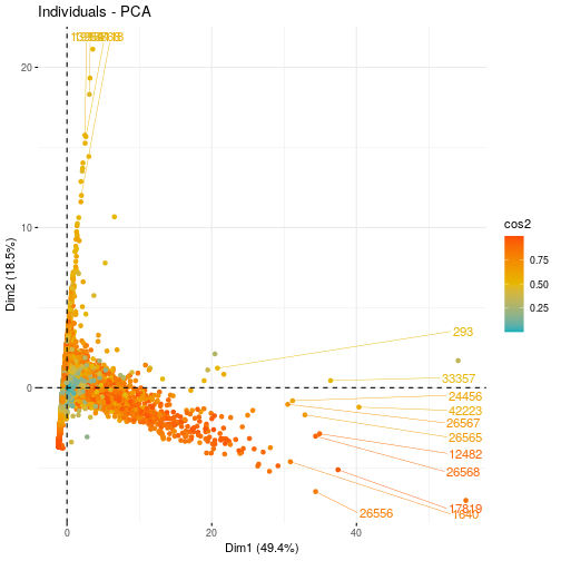<!-- --> ] ] --- background-image: url(./images/qslogo.PNG) background-size: 100px background-position: 90% 8% .panelset[ .panel[.panel-name[R Code] ```r # Biplot of individuals and variables factoextra::fviz_pca_biplot(res.pca, repel = TRUE) ``` ] .panel[.panel-name[Output] 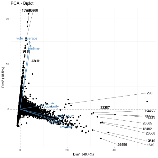<!-- --> ] ] --- class: inverse, center, middle # k-nearest neighbors (KNN) --- background-image: url(./images/qslogo.PNG) background-size: 100px background-position: 90% 8% # k-nearest neighbors (KNN) .panelset[ .panel[.panel-name[K-Nearest Neightbors] In theory we would always like to predict qualitative responses using the Bayes classifier. But for real data, we do not know the conditional distribution of `\(Y\)` given `\(X\)`, and so computing the Bayes classifier is impossible. Therefore, the Bayes classifier serves as an unattainable gold standard against which to compare other methods. Many approaches attempt to estimate the conditional distribution of `\(Y\)` given `\(X\)`, and then classify a given observation to the class with highest estimated probability. > One such method is the K-nearest neighbors (KNN) classifier. ] .panel[.panel-name[Mathematics] Given a positive integer `\(K\)` and a test observation `\(x_0\)`, the KNN classifier first identifies the neighbors `\(K\)` points in the training data that are closest to `\(x_0\)`, represented by `\(N_0\)`. It then estimates the conditional probability for class `\(j\)` as the fraction of points in `\(N_0\)` whose response values equal `\(j\)`: `$$Pr\left(Y=j\ |\ X\ =x_0\right) = \frac{1}{K}\sum_{i∈N_0}I\left(y_i =j\right)$$` Finally, KNN applies Bayes rule and classifies the test observation `\(x_0\)` to the class with the largest probability. ] ] --- background-image: url(./images/qslogo.PNG) background-size: 100px background-position: 90% 8% # k-nearest neighbors (KNN) .panelset[ .panel[.panel-name[Goal] .pull-left[ Our goal is to make a prediction for the point labeled by the black cross. Suppose that we choose `\(K = 3\)`. Then KNN will first identify the three observations that are closest to the cross. This neighborhood is shown as a circle. It consists of two blue points and one orange point, resulting in estimated probabilities of `\(2/3\)` for the blue class and `\(1/3\)` for the orange class. Hence KNN will predict that the black cross belongs to the blue class. Right-hand panel of the figure: we have applied the KNN approach with `\(K = 3\)` at all of the possible values for `\(X_1\)` and `\(X_2\)`, and have drawn in the corresponding KNN decision boundary. ] .pull-right[ <img src="./images/image2.png" width="100%" style="display: block; margin: auto;" /> ] ] .panel[.panel-name[Example] <img src="./images/knn1.png" width="50%" style="display: block; margin: auto;" /> ] ] --- background-image: url(./images/qslogo.PNG) background-size: 100px background-position: 90% 8% # k-nearest neighbors (KNN) .panelset[ .panel[.panel-name[Efficiency] .pull-left[ Despite the fact that it is a very simple approach, KNN can often produce classifiers that are surprisingly close to the optimal Bayes classifier. This figure displays the KNN decision boundary, using `\(K = 10\)`, when applied to the larger simulated data set from the first figure. The Bayes decision boundary is shown as a purple dashed line. The KNN and Bayes decision boundaries are very similar. ] .pull-right[ <img src="./images/image3.png" width="100%" style="display: block; margin: auto;" /> ] ] .panel[.panel-name[Choice of K] .pull-left[ The choice of `\(K\)` has a drastic effect on the KNN classifier obtained. This figure displays two KNN fits to the simulated data , using `\(K = 1\)` and `\(K = 100\)`. When `\(K = 1\)`, the decision boundary is overly flexible and finds patterns in the data that don’t correspond to the Bayes decision boundary. This corresponds to a classifier that has low bias but very high variance. As `\(K\)` grows, the method becomes less flexible and produces a decision boundary that is close to linear. This corresponds to a low-variance but high-bias classifier. ] .pull-right[ <img src="./images/image4.png" width="100%" style="display: block; margin: auto;" /> ] ] ] --- background-image: url(./images/qslogo.PNG) background-size: 100px background-position: 90% 8% # k-nearest neighbors (KNN) .panelset[ .panel[.panel-name[Goal] .pull-left[ Just as in the regression setting, there is not a strong relationship between the training error rate and the test error rate. With `\(K = 1\)`, the KNN training error rate is 0, but the test error rate may be quite high. In general, as we use more flexible classification methods, the training error rate will decline but the test error rate may not. ] .pull-right[ <img src="./images/image5.png" width="100%" style="display: block; margin: auto;" /> ] ] .panel[.panel-name[Errors] .pull-left[ The KNN training error rate (blue, 200 observations) and test error rate (orange, 5,000 observations) on the data from the first figure, as the level of flexibility (assessed using `\(1/K\)`) increases. The black dashed line indicates the Bayes error rate. The jumpiness of the curves is due to the small size of the training data set. Choosing the correct level of flexibility is critical to the success of any statistical learning method. The bias-variance tradeoff, and the resulting U-shape in the test error, can make this a difficult task. ] .pull-right[ <img src="./images/image5.png" width="100%" style="display: block; margin: auto;" /> ] ] ]